Engineering the Art of Problem Solving System™
- Read Time: 5 Min

Success is defined by how well you make decisions. Period.
What if you were a hotel company, and your revenue management team reported that demand is falling much more in the next quarter than projected? Would you take the traditional approach, have your data science and insight teams pull all the hotel and customer data, summarize the findings, and formulate a solution based on the answers you received from your data analysis? What if the demand continues to fall even after you’ve implemented the suggestions based on your analysis? Would you believe the data you collected is problematic or is it the approach you took to solve the problem?
The world continues to progress at a remarkable rate. Today, vast data sets are collected in the enterprise, robust analytical capabilities are at your fingertips. Many Fortune 500 companies have recognized the opportunity and have invested heavily in their Decision Support Ecosystem.
(Figure 1)
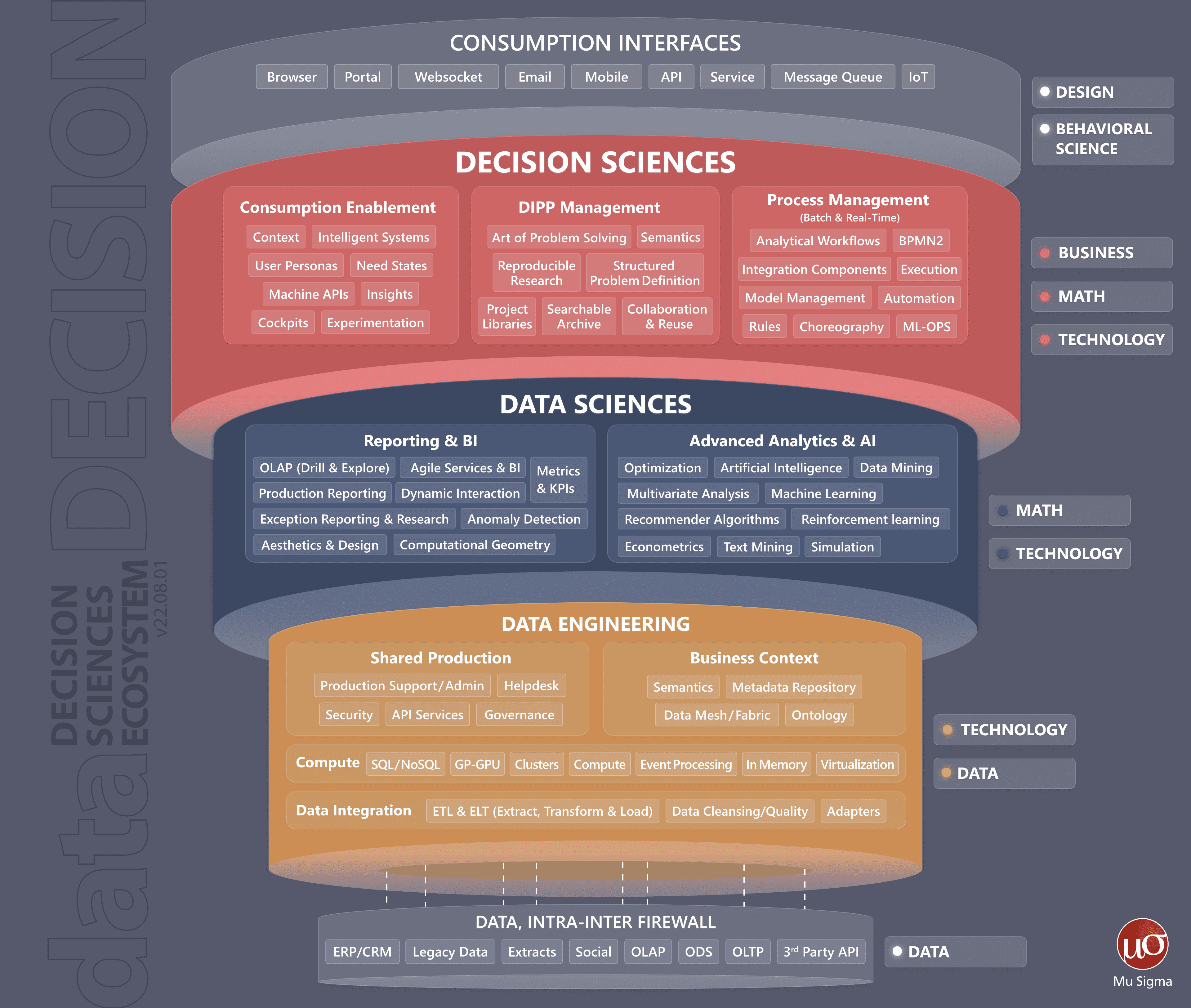
Figure 1. Decision Science is about data + data engineering + data science + business context
The Decision Support Ecosystem has three key components – Data Engineering, Data Science, and Decision Science, collectively called “D3”. Companies have invested more heavily in Data Engineering and Data Sciences. Market leaders have become adept at organizing the data, building dashboards (signal engines), analyzing data, and generating answers. But what about the business questions and context that generated the need for analytics? Are the “answers” driving decisions or just creating additional noise?
Most enterprises today have robust data governance and AI/ML model lineage. What about the governance of business questions? Are we asking the correct questions? Are there adjacent questions we should be cognizant of? The capabilities to document business problems, create transparency and persistence around them, and link them to data science and data engineering solutions are essential. The technology to do this is what we call the Art of Problem Solving System™ or Enquiry Engine. The Enquiry Engine complements the signal engine and enables the engineering of the Art of Problem-Solving System™. It exists in the realm of Decision Science, the third component of the D3 ecosystem.
Organizations recognize the increasing complexity of their business derived often through success like new product launches, acquisition of new customers, expansion to new geographies, etc., so the need for decision science and a new problem-solving approach increase. Consider a business enterprise as an organism, functioning independently and interacting with customer agents. Let us draw inspiration from the field of Complexity Science. The ability to materialize and visualize a complex system enables one to confront, learn and understand how to achieve transformation in an interrelated ecosystem. The idea is to instrument the complexity and represent it in a network structure to plan and achieve goals. Navigating complexity and achieving the transformation are two important dimensions of the Enquiry Engine, Figure 2 explains the high-level design.
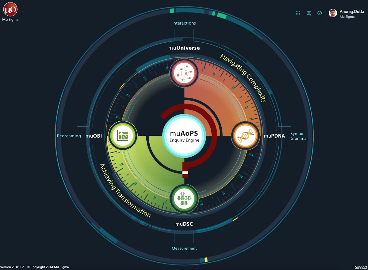
Figure 2. Enquiry Engine (Art of Problem-Solving) high-level design: Four key artifacts are organized into 2 domains. 1. Navigating and Harnessing Complexity using muPDNA (the problem DNA) & muUniverse. 2. Achieving Transformation through muOBI (outcomes, behaviors, insights) and muDSC (decision supply chain)
1. Navigating and Harnessing Complexity using muPDNA (the problem DNA) & muUniverse. 2. Achieving Transformation through muOBI (outcomes, behaviors, insights) and muDSC (decision supply chain)
Let’s explore how the Enquiry Engine (Art of Problem-Solving) toolkit engineers the pipeline from data to decisions, using structure and complexity science concepts.
Navigating Complexity: Leveraging muUniverse for Decision Sciences
The network of business problems forms the focal point for the business context. muUniverse allows you to visualize our organization’s current business problems, as seen in Figure 3. The canvas depicts the muPDNA™, a.k.a. the problem DNA, as colored circles. The muPDNA encodes problems in a way that promotes the best design and identifies business opportunities. The large white circles that orbit the business problems are muOBI™. The muOBIs help connect vision to an execution plan and align all stakeholders to it, which is key for achieving transformation. In the problem-solving process, it charts a continuum across two dimensions: realization of outcomes and transformation.
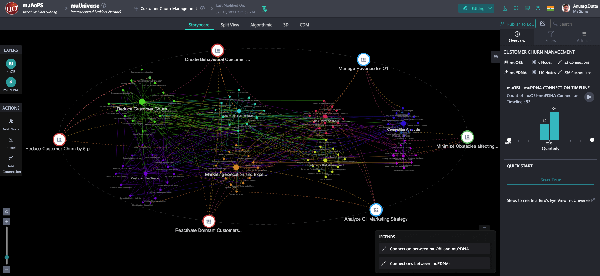
Figure 3. The muUniverse comprises muPDNAs and muOBIs visualizing your organizational business problems, the interconnections, and the actions we performed on them.
Let’s drill down into one of the muOBIs, Reactivating Dormant Customers, a program initiative to reactivate customers with no activity in 2023. Upon selecting that muOBI, as displayed in Figure 4, the interconnected business problems are highlighted. “Customer Reactivation” and “Customer Segmentation” are two influencer problems since they have many connections to other problems and by the relative diameter of these two muPDNAs.
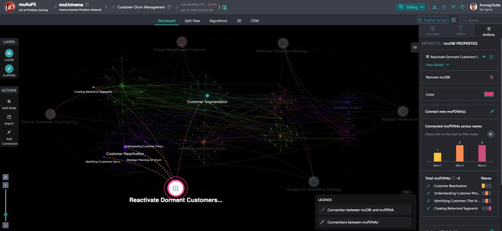
Figure 4. muOBI example: Reactivate Customers Dormant in 2023
To determine if other adjacent problem areas may be important to our Customer Reactivation problem, let’s examine the Customer Reactivation muPDNA node (Figure 5) to investigate 2nd order effects.
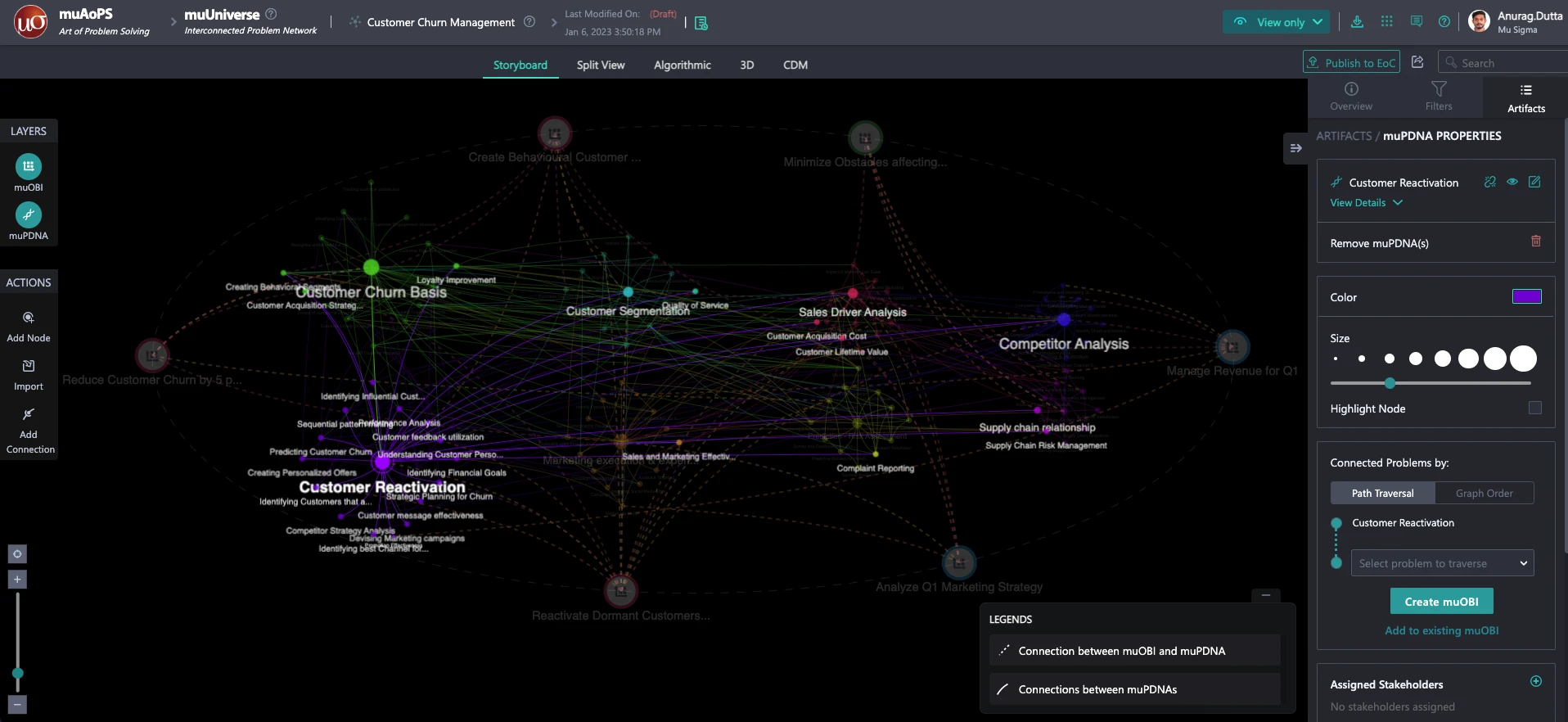
Figure 5. Second order effects of an Influencer node in our dominant problem region.
By closely examining “Customer Reactivation,” the following insights are derived:
- Customer Reactivation has many connections and is mostly localized to problems nearby. It is a rich area to learn about previous work and is indeed an influencer problem
- There are novel and new unexplored business possibilities lighting up, like ‘Sales Driver Analysis’ and ‘Competitor Analysis.’ These are influential problems that are adjacent and connected to our problem space
- ‘Sales Driver Analysis’ indicates that sales operations have an impact on reactivating dormant customers, and it is a 2nd order connection that should be included in our muOBI
- ‘Competitor Analysis’ indicates that competitive pressures and their promotions are influential in reactivation problems and again should be included in our muOBI
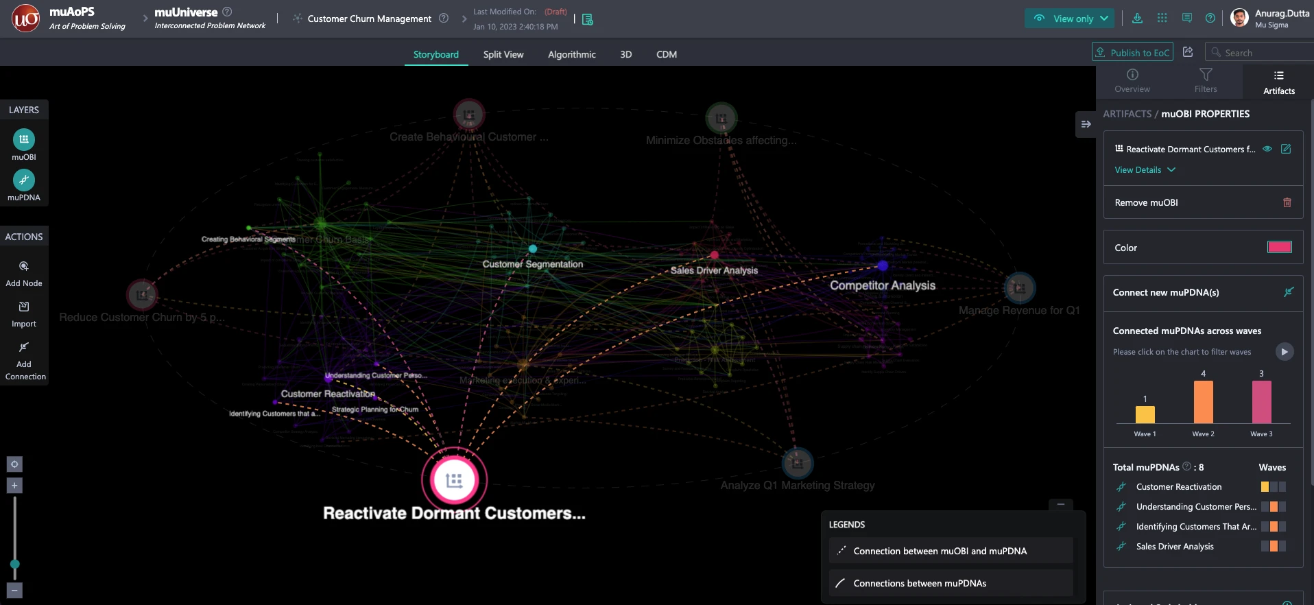
Figure 6. Final OBI post adding two more adjacent problems. Programs to ”Reactivate Customers Dormant in 2023”
Figure 6 represents our Final muOBI program initiative to activate dormant accounts for 2023. With the help of only two clicks from the muUniverse, we were able to rapidly probe the adjacent problem space and identify areas that were not included in the original muOBI but are influential.
Through the help of the Enquiry Engine, we dissected the complex network of business problems into smaller components. We explored the interconnected problems and derived meaningful insights, giving us an edge on success concerning reactivating dormant customers. Albert Einstein rightly said, “If I have 60 minutes to save the world, I will spend 55 minutes defining the problem.” In today’s increasingly complex world, having an Enquiry Engine like the Art of Problem Solving System™ that compliments your signal engines allows an organization to explore the complexity and make more informed and actionable decisions.


